|
Critical
Analysis of "That's Life": A
Reflection on Conflict and Acceptance
Il dipinto "That's
Life", olio su tela 50x50 cm, dell'artista internazionale Carlo
Trevisan (nato a Cesena), si inserisce nel suo ciclo di opere che
esplorano le relazioni umane e l'identità attraverso un linguaggio
visivo fortemente simbolico. A differenza della vicinanza e
dell'intimità descritte in "Together" e "The Golden Bottom", e
della solitudine contemplativa di "Enjoy", quest'opera introduce
un elemento di tensione e di distanza. Il dipinto, che come i
precedenti affronta il tema del rapporto tra uomini omosessuali,
lo fa con una delicatezza che non nasconde una profonda indagine
sulla conflittualità, sulla diversità e sull'accettazione. Rivolto
a un pubblico specializzato (storici dell'arte, curatori,
accademici), questo testo critico si propone di decodificare la
complessità di un'opera che, nel suo formato ridotto, racchiude
un'ampia gamma di significati.
La
Composizione: Distanza e Sospensione
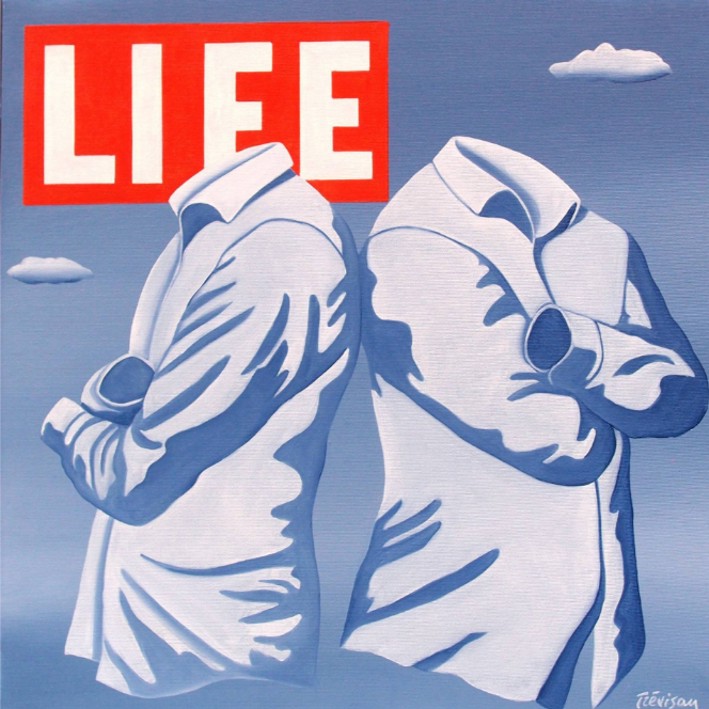
La composizione di
"That's Life" è caratterizzata da una cesura. Due figure maschili,
come sempre prive di testa, sono ritratte di spalle l'una
all'altra, in una posa che suggerisce una distanza emotiva
piuttosto che un abbraccio. Le braccia incrociate e la torsione
dei busti verso l'esterno creano un senso di chiusura e di
tensione. Questa non è la vicinanza complice di "Together", ma
l'immagine di un conflitto o, quantomeno, di un disallineamento.
Le figure sono separate, ma unite dallo stesso sfondo e dallo
stesso linguaggio pittorico, suggerendo che, nonostante il
conflitto, il loro destino è inestricabilmente legato.
Il fondo, un cielo
monocromatico di blu e grigio con nuvole stilizzate, è ormai un
elemento ricorrente nella poetica di Trevisan. Questo non-luogo,
sospeso tra il terreno e il metafisico, amplifica il senso di
isolamento delle due figure, rendendo il loro dramma interiore
un'esperienza universale. La dimensione ridotta della tela (50x50
cm) intensifica la concentrazione visiva e la carica emotiva,
costringendo lo spettatore a confrontarsi con l'intimità del
conflitto.
Il Titolo e il
Riferimento Culturale: Un'Ironica Accettazione
Il titolo
dell'opera, "That's Life" (È la vita), è una frase idiomatica che
esprime un'accettazione fatalistica e talvolta ironica delle
avversità e delle complessità dell'esistenza. Nel contesto del
dipinto, il titolo assume un significato profondo. Esso suggerisce
che la conflittualità e la distanza sono parte integrante di
qualsiasi relazione, compresa quella omosessuale. Trevisan, con
questa scelta, si distacca da una visione idealizzata dell'amore e
propone una rappresentazione più matura e realistica. Le
difficoltà, le incomprensioni, le tensioni non sono un'eccezione,
ma la "vita" stessa.
Il logo della
rivista "LIFE" in alto, con il suo rosso vivace, crea una tensione
visiva con la sobrietà cromatica del resto del dipinto. Come nelle
altre opere, il logo non è un semplice ornamento, ma un commento
critico. Se in "Together" era un'affermazione di visibilità, qui
diventa un'affermazione di onestà. "LIFE" è anche questo: non solo
amore e abbracci, ma anche conflitti e distanze. Trevisan
suggerisce che la rappresentazione della vita, anche in un
contesto popolare come una copertina di rivista, deve includere la
complessità e le ombre, non solo le luci.
Critical Analysis of "That's Life" by
Carlo Trevisan: A Reflection on Conflict and Acceptance
The painting "That's Life," oil on canvas,
50x50 cm, by internationally renowned artist Carlo Trevisan (born
in Cesena), is part of his series of works exploring human
relationships and identity through a highly symbolic visual
language.
Unlike
the closeness and intimacy depicted in "Together" and "The Golden
Bottom," and the contemplative solitude of "Enjoy," this work
introduces an element of tension and distance.
The
painting, which like its predecessors, addresses the theme of
relationships between homosexual men, does so with a delicacy that
does not conceal a profound exploration of conflict, diversity,
and acceptance.
Aimed
at a specialized audience (art historians, curators, academics),
this critical text aims to decode the complexity of a work that,
in its small format, encompasses a wide range of meanings.
The Composition: Distance and Suspension
The composition of "That's Life" is
characterized by a caesura.
Two
male figures, headless as always, are portrayed with their backs
to each other, in a pose that suggests emotional distance rather
than an embrace.
Their
crossed arms and outward twisting of the torsos create a sense of
closure and tension.
This
is not the complicit closeness of "Together," but the image of
conflict, or at least misalignment.
The
figures are separated, yet united by the same background and the
same pictorial language, suggesting that, despite the conflict,
their fates are inextricably linked. The background, a
monochromatic blue and gray sky with stylized clouds, has become a
recurring element in Trevisan's poetics.
This
non-place, suspended between the earthly and the metaphysical,
amplifies the two figures' sense of isolation, making their
internal drama a universal experience.
The small
size of the canvas (50x50 cm) intensifies the visual concentration
and emotional charge, forcing the viewer to confront the intimacy
of conflict.
The Title and Cultural Reference: An
Ironic Acceptance
The title of the work, "That's Life," is an
idiomatic phrase expressing a fatalistic and sometimes ironic
acceptance of the adversities and complexities of existence.
In the
context of the painting, the title takes on a profound meaning.
It
suggests that conflict and distance are an integral part of any
relationship, including homosexual ones.
With
this choice, Trevisan distances himself from an idealized vision
of love and offers a more mature and realistic representation.
The
difficulties, misunderstandings, and tensions are not exceptions,
but "life" itself. The "LIFE" magazine logo at the top, with its
vibrant red, creates a visual tension with the chromatic sobriety
of the rest of the painting.
As in the
other works, the logo is not a mere ornament, but a critical
commentary.
If
"Together" was a statement of visibility, here it becomes a
statement of honesty.
"LIFE" is
also this: not just love and embraces, but also conflict and
distance.
Trevisan
suggests that the representation of life, even in a popular
context like a magazine cover, must include complexity and shadows,
not just light.
L'Indagine
Psicologica Attraverso il Linguaggio del Corpo
In assenza di
volti, il linguaggio del corpo diventa il veicolo principale della
narrazione psicologica. Le due figure, sebbene prive di identità
specifiche, sono cariche di una personalità suggerita. La posa di
spalle l'una all'altra, con le braccia incrociate e i pugni
stretti, evoca un senso di rabbia, di frustrazione o di profonda
tristezza. La pittura di Trevisan, con la sua meticolosa
attenzione alle pieghe e alle ombre delle camicie, trasforma il
tessuto in una sorta di pelle emotiva, capace di esprimere ciò che
il volto non può.
Le ombre e le
luci, rese con sfumature di blu e bianco, modellano i corpi in
modo quasi scultoreo, ma al contempo li rendono eterei, sospesi.
La luce sembra cadere sulle spalle delle figure, evidenziando la
loro solitudine, mentre le ombre scure nelle pieghe del tessuto
alludono ai sentimenti nascosti. L'opera diventa un'indagine sulla
comunicazione non verbale, sulla capacità dei corpi di esprimere
le tensioni emotive più profonde.
L'Approccio al
Tema Gay: Sottile e Universale
L'approccio di
Trevisan al tema del rapporto gay in "That's Life" è di una
notevole sottigliezza. L'artista non si limita a rappresentare una
coppia omosessuale, ma ne esplora le complessità con un linguaggio
universale. Il conflitto rappresentato non è specifico di una
relazione gay, ma è un'esperienza che può essere condivisa da
qualsiasi coppia. Questa scelta ha una duplice valenza: da un
lato, normalizza la relazione omosessuale, mostrandola con tutte
le sue sfaccettature; dall'altro, eleva il tema a un livello di
universalità, superando i confini dell'identità sessuale.
L'opera suggerisce
che la vera accettazione non consiste solo nel rappresentare
l'amore e l'armonia, ma anche nel riconoscere e nel mostrare le
difficoltà, i momenti di crisi, le distanze. "That's Life" è un
dipinto onesto, che non ha paura di affrontare le ombre delle
relazioni, dimostrando che anche la conflittualità è una parte
intrinseca dell'esperienza umana e, di conseguenza, della vita.
Conclusioni:
Un'Opera di Grande Matura e Onestà
In conclusione, "That's
Life" di Carlo Trevisan è un'opera di grande spessore critico e di
notevole profondità emotiva. Attraverso una composizione che mette
in scena la distanza e la tensione, l'artista propone una
riflessione matura e onesta sulla complessità delle relazioni
umane. Il titolo ironico, il riferimento alla cultura pop e la
pittura raffinata che trasforma i corpi senza volto in veicoli di
emozione, fanno di "That's Life" un dipinto di grande valore nel
panorama della pittura contemporanea. L'opera si distingue per la
sua capacità di affrontare un tema delicato con una sensibilità
che non teme di esplorare le ombre, dimostrando che la vera arte
risiede non solo nella rappresentazione della bellezza e
dell'armonia, ma anche nell'onesta esplorazione delle
sfaccettature più difficili dell'esistenza.
Psychological Investigation Through Body
Language
In the absence of faces, body language
becomes the primary vehicle of psychological narration.
The two
figures, though devoid of specific identities, are imbued with a
suggestive personality.
Their
pose, with their backs to each other, arms crossed and fists
clenched, evokes a sense of anger, frustration, or profound
sadness.
Trevisan's painting, with its
meticulous attention to the folds and shadows of the shirts,
transforms the fabric into a sort of emotional skin, capable of
expressing what the face cannot. The shadows and lights, rendered
in shades of blue and white, shape the bodies in an almost
sculptural way, yet at the same time render them ethereal,
suspended.
The light
seems to fall on the figures' shoulders, highlighting their
solitude, while the dark shadows in the folds of the fabric allude
to hidden feelings.
The work
becomes an investigation into nonverbal communication, into the
bodies' ability to express the deepest emotional tensions.
The Approach to Gay Relationships: Subtle
and Universal
Trevisan's approach to
the theme of gay relationships in "That's Life" is remarkably
subtle.
The artist doesn't simply depict a same-sex
couple, but explores their complexities with a universal language.
The conflict depicted is not specific to a
gay relationship, but is an experience that can be shared by any
couple.
This choice serves a dual purpose: on the
one hand, it normalizes same-sex relationships, showing them in
all their nuances;
on the other, it elevates the theme to a
level of universality, transcending the confines of sexual
identity. The work suggests that true acceptance consists not only
in depicting love and harmony, but also in acknowledging and
showing difficulties, moments of crisis, and distances.
"That's Life" is an honest painting,
unafraid to address the shadows of relationships, demonstrating
that conflict is also an intrinsic part of the human experience
and, consequently, of life. Conclusions: A Work of Great Maturity
and Honesty In conclusion, Carlo Trevisan's "That's Life" is a
work of great critical depth and remarkable emotional depth.
Through a composition that dramatizes
distance and tension, the artist offers a mature and honest
reflection on the complexity of human relationships.
The ironic title, the reference to pop
culture, and the refined painting style that transforms faceless
bodies into vehicles of emotion make "That's Life" a highly
significant work in contemporary painting.
The work stands out for its ability to address a delicate subject
with a sensitivity that is unafraid to explore the shadows,
demonstrating that true art lies not only in the representation of
beauty and harmony, but also in the honest exploration of the most
difficult facets of existence.
|